

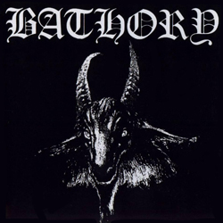
Above is the artwork for 1349's upcoming release, Demonoir. The album has already generated some discussion 'round these parts for its promised return to the band's more traditional black metal sound and it seems the artwork is in keeping with the concept: not only - as Seth pointed out in an email to me - does the title font have a lot in common with the font used by Bathory, but the art has some substantial feel to it the way Hellfire did and Revelation of the Black Flame did not. However, though I think the Lovecraftian horror in the backgorund is pretty cool, there's something that bothers me about the whole presentation. Part of it is the eyes in the darkness, which seems just a little too cheesy evil; part of it might be the blocks surrounding the letters in the title font, which - either at first blush, or maybe because of the pixelation of the image - look like those Celtic-style fonts from a free font catalog that are meant to imitate illuminated manuscripts. I guess if they're trying to play up their old-school kvlt cred, using all of the cheesy old school artwork tricks emphasizes the point...
What do you all think?
Via Blabbermouth


2 comments:
Not sure how I feel about the cover. Certainly the eyes in the darkness is a bit of cheese that seems to undermine the otherwise nebulous but interesting art.
The font doesn't bother me as much as the eyes do.
I think that my opinion of the art will come as a complete package with the album itself.
If 1349 wanted to do an old school black metal cover they would made it in black and white.
I don't care about the artwork of any band. What's important obviously is the content of the album musically speaking. I've heard a new song on their myspace page and sounds great.
Post a Comment